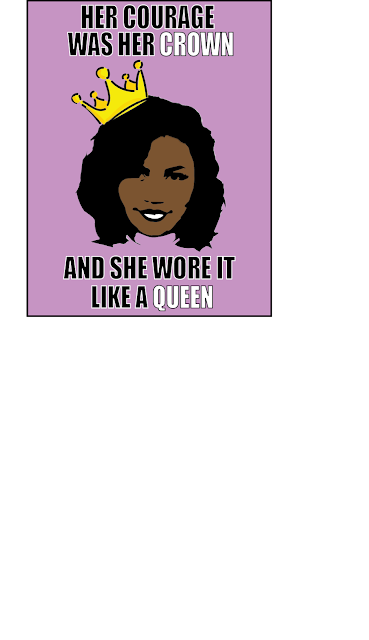
This is the poster that I designed for class. Overall, I believe the look of the poster is fairly aesthetic. It took me a while to figure out the message I was going for and when I thought of the crown, it was like a lightbulb going off in my head. I do believe that the beams help make the poster pop out more and the yellow beams look a little better, however I included both posters in terms of keeping with 4 colors max.


Comments
Post a Comment